
One of the fundamental tools in a trader’s arsenal is the chart. Charts visually represent the historical and real-time movement of currency pairs, allowing traders to make informed decisions. They are the heart of technical analysis. There are several types of charts used in Forex trading, but the most important ones are candlestick charts and line charts; these are the only types of charts a trader is ever gonna use 99% of the time. This article delves into the various types of charts in Forex trading and their applications.
What are Charts?
A chart shows the prices at which an asset was traded over time. It’s a graphical representation of historical prices. When you look at it, you can see the prices that the asset traded at during those times. This helps indicate supply and demand over time. If prices were going up at a certain point, it meant demand for the asset was higher than supply, causing prices to rise. If prices were going down, it meant more people wanted to sell the asset, and fewer people wanted to buy it, causing prices to fall. That’s essentially what a chart tells you.
The main reason we use a chart is to try to predict where the asset price will go in the future based on how it has moved in the past.
What is a Line Chart?
The line chart is the simplest chart used in Forex trading. It plots a single line from one closing price to the next, providing a clear and straightforward representation of the currency pair’s price movement over a specific period.
Advantages of Line Chart
- Simplicity: Easy to read and interpret, making it suitable for beginners.
- Clarity: Helps in identifying the overall direction or trend of the market without the noise of price fluctuations within the time period.
Disadvantages of Line Chart
- Limited Information: It does not provide details on the open, high, and low prices, only the closing price.
- Less Useful for Short-Term Trading: Not ideal for traders who rely on precise entry and exit points.
Use Case of Line Chart
Line charts are often used for a quick overview of the market’s direction, particularly in longer-term analysis, where the focus is on the trend rather than minute-by-minute price changes.
What is the Candlestick Chart?

Candlestick charts present the information in a more visually appealing way. Each “candlestick” represents a time period and shows the open, high, low, and close prices. The body of the candlestick is colored to indicate whether the closing price was higher (usually green or white) or lower (usually red or black) than the opening price.
Advantages of Candlestick Charts
- Visual Appeal: Easier to read and interpret compared to bar charts.
- Pattern Recognition: Allows for the identification of specific patterns that can indicate market sentiment and potential reversals.
Disadvantages of Candlestick Charts
- Over-reliance on Patterns: Traders may over-rely on candlestick patterns without considering the broader market context.
- Complexity: It can still be complex for beginners, especially when identifying and interpreting different candlestick patterns.
Use Case of Candlestick Charts
Candlestick charts are widely used by technical analysts due to their ability to convey market sentiment and potential turning points through recognizable patterns.
Which Type of Chart Should You Use?
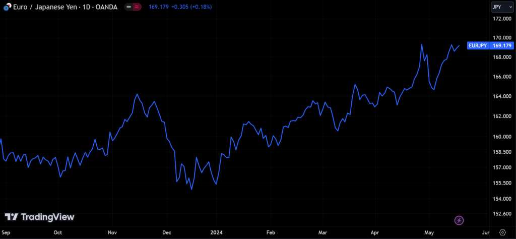
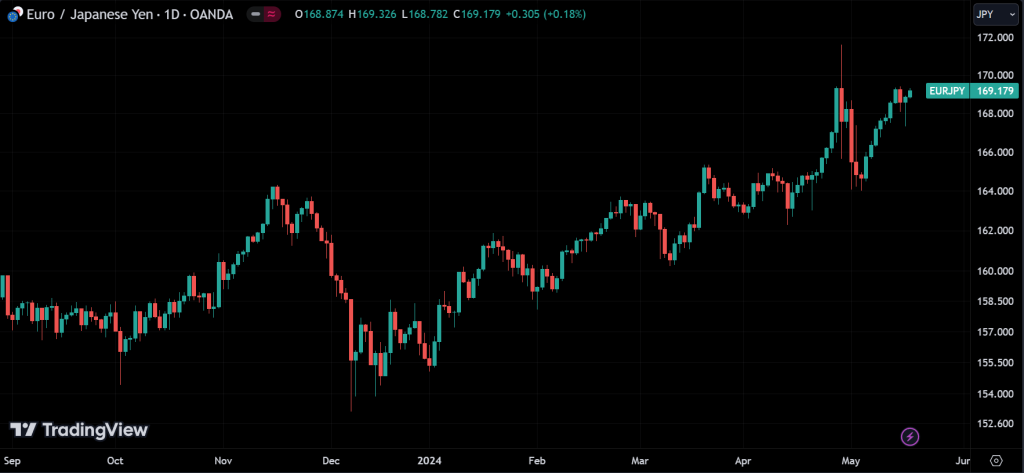
We use candlestick charts 99% of the time because they give the most detailed information. Sometimes, we use line charts to get a broader view of an asset, but candlestick charts show exactly how the price has moved.
Let me explain. Look at the two charts provided. A line chart connects every price point over time with a line. It shows you things like, “On this day, the price was this,” or “The last trade of the day was at this price.” It simply tells you the price at different times.
On the other hand, candlestick charts do the same thing but give more details. They show where the asset started trading for the day, the highest and lowest prices it reached, and where it closed. When prices suddenly move, candlestick charts show how that move happened in a way that’s easier to understand, while a line chart just shows that it moved. You can see this by comparing the two pictures above.
There are other chart types, like bar charts, Heikin-Ashi charts, and Renko charts, but they are less useful. In trading, there’s a lot of information out there. Interestingly, the more information you use to make a decision, the more likely you are to make mistakes. So, it’s best to avoid useless information and focus on the most useful ones.
One of the best charting software available today is TradingView. It’s free and very powerful.
Conclusion
Each type of chart in Forex trading offers unique advantages and is suited to different trading styles and strategies. Line charts provide simplicity, and candlestick charts facilitate pattern recognition. Understanding the characteristics and applications of each chart type allows traders to select the best tools for their trading approach, ultimately aiding in making more informed and profitable trading decisions.