

A liquidity indicator for TradingView usually does one job. It finds equal highs and lows plus the obvious swing points, and draws a line at each one. That part is easy, and dozens of free scripts do it well. Most stop there. We wanted to know how often price had actually gone to those levels on a given chart, so we built a free, open-source one that keeps score. The Liquidity Draw Probability Map marks the levels where stop orders tend to sit (each one is a pool) and counts, from that chart’s own history, how often similar pools were reached and how long that took. It also logs whether each touch turned price around, pushed through, or stalled. The “probability” in the name means those counted frequencies from the past.
Key Takeaways
- Free, open-source liquidity indicator for TradingView that maps equal highs and lows, the prior day and prior week high and low, and the high and low of a session you choose
- Each pool formed in the last 50 bars is labeled with a count from your own chart. Once enough similar pools have played out, that label shows what share of them price reached within 50 bars, how long that usually took, and how often price then turned back or pushed through
- A Net Draw Bias score weighs those pools above price against the ones below and shows when the mix has shifted toward one side compared with its usual level on this chart
- It fires no buy or sell signals, and every reach and touch percentage shows how many pools or touches it’s built on
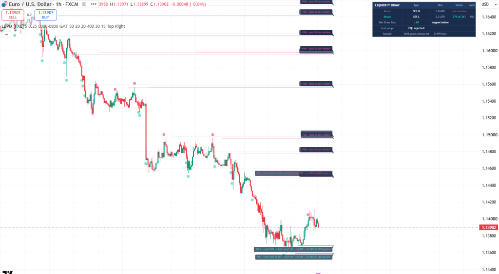
Table of Contents
What does this liquidity indicator for TradingView map?
Resting liquidity is where stop orders and pending orders tend to pile up, and on a chart it shows up in a few predictable places. The script tracks four of them.
- Equal highs and equal lows. When two consecutive confirmed swing highs, or two swing lows, form within a quarter of an ATR of each other, the script treats them as one pool. (ATR is the Average True Range, the pair’s typical bar size over the last 14 bars. The script uses it as its ruler.) Anyone who sold that double top usually has a stop just above it, and that pile of stops is what makes the level worth watching. The labels call them EQH and EQL.
- The prior day high and low, on intraday charts, labeled PDH and PDL. If you’re after previous day high and low lines on TradingView, it draws them, and takes each one off the chart once price trades into it.
- The prior week high and low, on any chart faster than weekly, labeled PWH and PWL.
- The high and low of a session you choose, labeled SES H and SES L. The default is the Asia window, 00:00 to 08:00 GMT, and both the hours and the timezone can be changed.
Pools above price draw in pink and pools below draw in teal. Equal-level lines start at the second swing, session lines at the session open, and prior day and week lines at the start of the new day or week. All of them extend a little past the last bar, so the live levels sit right in front of you. A level that price has already traded through by the time it forms is skipped, since those orders are already gone. And the moment price trades into a pool, its line comes off the chart. A small circle prints on the bar where that happened: pink above the bar when a pool overhead is taken, teal below it when a pool underneath is taken. The circles only mark the touches the script goes on to measure. They aren’t entries, and you can switch them off with the Purge markers setting.
What is draw on liquidity, and what does the script count?
Draw on liquidity (DOL) is the smart money idea, popularized by ICT (the Inner Circle Trader), that price tends to travel toward pools of resting orders, mostly the stop losses above recent highs and below recent lows. The draw is the specific pool a trader expects price to reach next. The idea describes a tendency, and plenty of pools are never reached.
Why there? Large orders need someone on the other side to fill against, and much of that other side sits in the stops above highs (buy-side liquidity) and below lows (sell-side liquidity). That’s the reasoning behind the idea that price often runs into one of those pools before it picks a direction.
The catch is that it’s almost always said after the fact. Once price has taken out a high, people say that high was the draw. Nobody knows in advance which pool on your chart goes next. What you can check is how often each kind of pool was reached on your chart before. That record is what a draw on liquidity indicator can honestly measure, and it’s the count this script keeps.
Every pool is filed by three things: its type, its side (a high or a low), and how far from price it was when it formed. Distance is measured in ATR, so a distance band means the same thing on gold as it does on EURUSD. There are four bands, from under half an ATR out to two ATR and beyond. Each combination is what this page calls a kind of pool. For each kind, the script keeps a running count of:
- how many pools like this have finished their 50-bar window
- how many of them price reached inside that window
- of the touches that have played out, how many rejected and how many cut through, going by whichever close comes first from the touch bar through the next 20 bars: a close at least 1 ATR back inside counts as a rejection, and a close at least half an ATR beyond counts as a cut through. Touches that do neither are filed as stalls.
- the median number of bars the reached ones took to get there
A pool only joins the count once its window has closed, so levels still waiting their turn never drag the numbers down. No outside data goes in. These counts describe your chart’s past, and the next pool is free to break the pattern.
The script also leaves one kind of liquidity out. ICT traders split liquidity by where it sits. In the usual split, external range liquidity is the stops resting beyond old highs and lows and the edges of a range, and internal range liquidity is the unfilled fair value gaps inside that range. Every pool here is an old high or low with stops beyond it, which is the external kind. It doesn’t track fair value gaps. On TradingView, our FVG + Order Block Toolkit marks those.
How do you read a pool label?
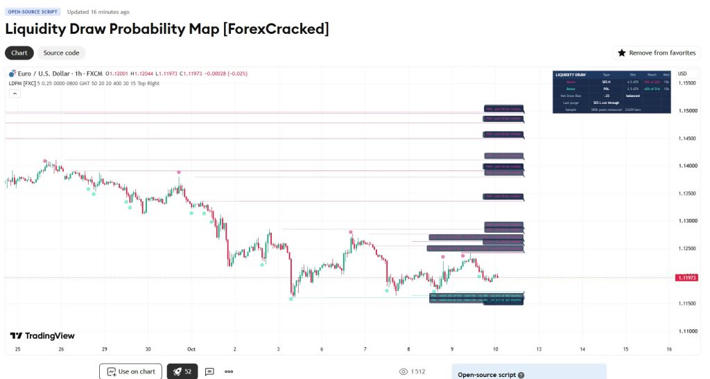
Each pool still inside its 50-bar window carries a short label with the counts for its kind. Labels for pools below price hang just under their line, and labels for pools above price sit just on top of theirs. This one belongs to the lowest teal line in the screenshot above, the thickest on the chart, a prior day low on EURUSD, 1 hour:
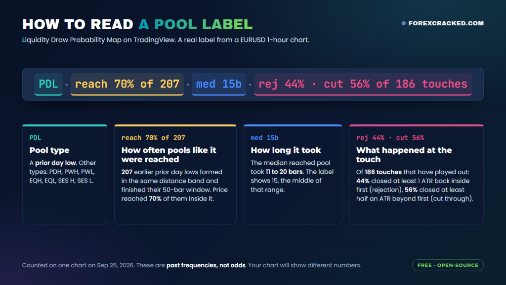
PDL · reach 70% of 207 · med 15b · rej 44% · cut 56% of 186 touches
Read it left to right:
- PDL is the pool’s type, a prior day low.
- reach 70% of 207 means 207 earlier prior day lows formed about as far from price as this one did (the same distance band, measured in ATR) and have since had their full 50 bars. Price reached 70 percent of them within those 50 bars.
- med 15b is the median number of bars the reached ones took, counted from the bar each one formed. The script tracks that in ranges, so 15b means the median fell in the 11 to 20 bar range.
- rej 44% · cut 56% of 186 touches covers the 186 touches the script has finished scoring. In 44 percent of them, price closed at least 1 ATR back above the low before any close at least half an ATR below it. That’s a rejection (rej). In 56 percent, the close at least half an ATR below came first, which is a cut through (cut).
The cut-through line sits half as far from the level as the rejection line, so it tends to get crossed first, and a touch that cut through and then swung back still counts as a cut. Almost none stalled on this chart. Twenty bars is usually enough for price to close past one of the two lines. The 186 touches outnumber the roughly 145 pools reached in time (70 percent of 207), mainly because a pool touched after its 50-bar window still counts as a touch. So the rejection and cut-through shares include those late touches too.
Those figures are a snapshot of one chart on one day. Neither the 70 percent nor the 44/56 split is the odds for this pool. Both describe prior day lows that have already played out. The figures shift as new pools finish their windows, and yours will differ by pair, timeframe, settings and how much history your chart loads.
You can read the lines before the labels. A kind of pool with a higher reach frequency gets a thicker, more solid line, so the levels price went to in the past stand out and the ones it ignored fade back. Until a kind of pool has 20 finished pools behind it, its label reads “building” with the count so far instead of a percentage (or “no data yet” before the first one). That’s deliberate. A percentage built on 6 pools is a rumor.
If a pool sits untouched through its whole 50-bar window, it’s logged as a miss for its kind. It stays on the chart as a faded line marked “past 50-bar window” until price takes it, a fresh pool forms at the same level, or the max age or pool cap retires it. It’s still resting liquidity, but the reach figure for its kind describes pools inside their window, and this one’s window has closed. So its label stops quoting that figure, and the pool drops out of Net Draw Bias and the Approaching high-draw pool alert.
Net Draw Bias: which way the weight has shifted
One pool’s reach frequency tells you about one level. When price is boxed in between several, you want to know whether their combined weight has shifted to one side. Net Draw Bias takes every pool still inside its reach window, weights it by the reach frequency of its kind, discounts it by how far away it currently sits, and adds up everything above price against everything below. Kinds of pool that haven’t reached the minimum sample yet are left out.
That total is then scored against its own last 250 bars, in standard deviations (a z-score), so zero means the split is about normal for this chart. On the dashboard it prints as a number and a plain verdict. Above 0.5, the total sits more than half a standard deviation above its average for those 250 bars, and the verdict reads “magnet above”. Below minus 0.5 it reads “magnet below”, and anything in between reads “balanced”. A “magnet above” verdict can come from more weight overhead than usual or from less underneath. It doesn’t mean more weight sits above right now, and price is free to go either way.
The dashboard and alerts
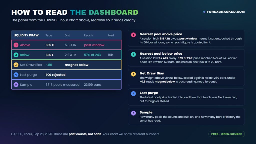
The panel in the corner repeats the key numbers so you don’t have to hunt through labels:
- Above: the nearest pool above price, its type, its distance in ATR, the reach frequency of its kind with the sample size (or “past window” for an old untouched level), and the median bars the reached pools of its kind took, counted from when each one formed
- Below: the same for the nearest pool underneath
- Net Draw Bias: the score and the verdict
- Last purge: the latest purge outcome: which pool price traded into, and whether it rejected or cut through (shown on the bar it happens) or stalled (shown when its 20-bar window runs out)
- Sample: how many pools the script has measured and how many bars of history it has read
Three alerts come with it:
- Approaching high-draw pool: price is within a quarter of an ATR of a pool still inside its 50-bar window whose kind was reached at least 70 percent of the time, with 30 or more pools behind that figure
- Liquidity purged: a pool was just taken
- Net Draw Bias flip: the verdict switched from magnet above to magnet below, or the other way around
Settings
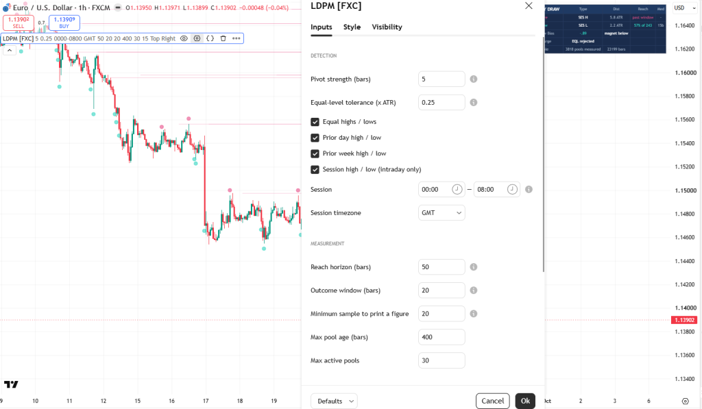
You can leave the defaults alone to start. These are the ones worth knowing:
- Pivot strength: 5 bars on each side. A swing needs this confirmation before it can form part of an equal high or equal low, so a pool never appears on a swing that hasn’t finished forming.
- Equal-level tolerance: 0.25 ATR. How close two swings have to be to count as one pool.
- Session and timezone: the window whose high and low become pools. The default is 00:00 to 08:00 GMT, and the timezone is picked from a list of six. If you want the sessions themselves shaded on the chart, our ICT Killzones & Session Liquidity Levels script does that job and runs fine alongside this one.
- Reach horizon: 50 bars, adjustable up to 60. A pool only counts as reached if price gets there inside this window.
- Outcome window: 20 bars. How long the script watches after a touch before filing it as a rejection, a cut through or a stall.
- Minimum sample: 20. How many finished pools a kind of pool needs before its reach percentage prints, and how many settled touches it needs before the rejection and cut-through shares appear. Until the touches get there, the label shows the reach figure with no split.
- Max pool age and max active pools: 400 bars and 30 pools. A pool price never touches comes off the chart after 400 bars. The 30 covers every pool the script is tracking, including touched ones still inside their outcome window, which aren’t drawn. At 30, the oldest level already marked “past 50-bar window” makes room for a new one. If there isn’t one, the new level is skipped, so no count in progress gets thrown away.
- Purge markers: on by default. The small circle on the bar where price took a pool. Switch them off for a cleaner chart.
Session pools, like prior day pools, need an intraday chart. Equal highs and lows work on any timeframe. On a chart that’s too slow for a pool type, the script doesn’t create that type at all.
How to add it on TradingView
- Open the script page: Liquidity Draw Probability Map [ForexCracked] (link below).
- Click Add to favorites, or click Use on chart to load it straight away.
- On your chart, open the Indicators menu, go to Favorites, and click Liquidity Draw Probability Map [ForexCracked].
- Use a chart with plenty of history so the counts have something to work with. A 15-minute or 1-hour chart works well, and the Sample row on the dashboard shows how much the script has measured.
Liquidity Draw Probability Map [ForexCracked]
![Liquidity Draw Probability Map [ForexCracked]](https://www.forexcracked.com/wp-content/uploads/2026/10/liquidity-draw-map-chart.png)
A free, open-source liquidity indicator for TradingView that maps equal highs and lows, prior day and week levels and session extremes, and counts how often each kind of pool was reached on your chart.
Pros
- Counts how often each pool type, side and distance got reached
- Splits settled touches into rejection and cut-through shares
- Net Draw Bias weighs in-window pools above price against pools below
- Every percentage on a label prints how many pools or touches it comes from
- Taken pools drop off the chart; only live liquidity stays
Cons
- Needs plenty of history before figures print
- Day and session pools need intraday charts, week pools anything faster than weekly
- Counts are per chart and don't carry across pairs
- Time to reach is reported in bands, not exact bars
Summary
We built this because most liquidity scripts draw the pools and stop there. This one counts, on your own chart, how often pools like each one were reached, how long it took and how the touch resolved, then weighs the pools still inside their reach window, in kinds with enough history, into a single Net Draw Bias reading. Taken pools come off the chart, so only live liquidity stays. Free and open-source.
 Need a TradingView account?The free plan runs this indicator, with charts, alerts and watchlists.
Start free
Need a TradingView account?The free plan runs this indicator, with charts, alerts and watchlists.
Start free

 Built by ForexCrackedWe tested 1,200+ indicators. Then we built our own.Six years of reviewing EAs and indicators went into FXC Fusion: two engines, the seven-panel cockpit, MT4 and MT5, from the team behind this site.
How to trade with it
Use it as a map and take entries from your own structure.
Start with the dashboard. The nearest pool above and the nearest below, each with its reach frequency and its distance in ATR, show where price has tended to go on this chart. A high reach frequency means pools like this one were usually reached on this chart, which makes it one input to weigh when you plan a target. It says nothing certain about this particular pool.
Then read the rejection and cut-through split before you assume a reaction. On one chart, price has mostly run straight through the prior day high. On another, the same level has turned it back more often than not. The split shows how that kind of level has behaved on this chart so far, and that’s worth knowing before you put a stop a few pips beyond a level everyone else can see.
Use Net Draw Bias when price is sitting between levels and you want to know which way the weight has shifted compared with usual. Then pair all of it with your own structure and risk rules.
Why doesn’t it fire buy or sell signals?
There are no buy or sell arrows here, no sweep alerts dressed up as entries, no order blocks and no fair value gaps. We left all of that out on purpose. A signal is a prediction, and this tool shows the record a prediction should be checked against. If you want a heads-up when price trades through a level and closes back inside, that’s a different job, and we built a separate script for it, Liquidity Sweep & Stop-Hunt Signals. The two sit on the same chart without getting in each other’s way.
How we built and checked it
The Liquidity Draw Probability Map was built from scratch in Pine Script v6 and published open-source. Nothing in it is ported from another script, and every rule described on this page can be checked against the code on its TradingView page.
Before this article went out, the code was checked line by line against every claim made here. That check caught a bug in the earlier version: on chart history, the prior day and prior week levels were read one day or week further back than on live bars, so the prior day and prior week counts were built on the wrong levels. The update we published on September 26, 2026, version 1.2, fixed it. The same update split the counts for highs and lows, which the earlier version lumped together, and stopped unfinished pools from dragging the reach figures down.
The screenshots on this page come from that fixed version, on a EURUSD 1-hour chart where the script had measured 3,818 pools across 23,199 bars. If you spot something on your chart that doesn’t match what’s written here, the code is open, so you can check which one is wrong.
More liquidity tools for MetaTrader and TradingView
Trading on MetaTrader, or want a strategy built around liquidity? We cover liquidity on MetaTrader too, just not with this measurement engine. There’s our liquidity zone indicator for MT4 and MT5, and MT4 users also get a buyside and sellside liquidity indicator. If it’s the strategy you’re after, pair the forex liquidity and market sentiment indicator with our forex liquidity strategy. For session timing, the ICT kill zones indicator shades the sessions on MetaTrader, and the forex market hours tool shows when each session opens. Or browse all of our TradingView indicators and the full free forex indicators library.
Frequently Asked Questions
Add the Liquidity Draw Probability Map on TradingView
The Liquidity Draw Probability Map is free and open-source. Add it to your charts here: Liquidity Draw Probability Map on TradingView
Risk disclaimer: The Liquidity Draw Probability Map is an analytical tool that maps resting liquidity and counts how often similar levels were reached on the chart’s own history. Those counts describe the past. A kind of pool that was reached 80 percent of the time can be ignored today, samples vary by pair and timeframe, and small samples are unreliable by nature. The indicator does not predict price and does not place trades. Results depend on market conditions, your settings, and your own execution and risk management. This is shared for educational purposes and is not financial advice.


Discussion no comments yet
Is this still working?
Nothing here yet
No one has asked anything about Liquidity Indicator for TradingView That Keeps Score yet. First question gets answered.